BoldGrid Support Home Page Redesign
UI/UX Design | 2018
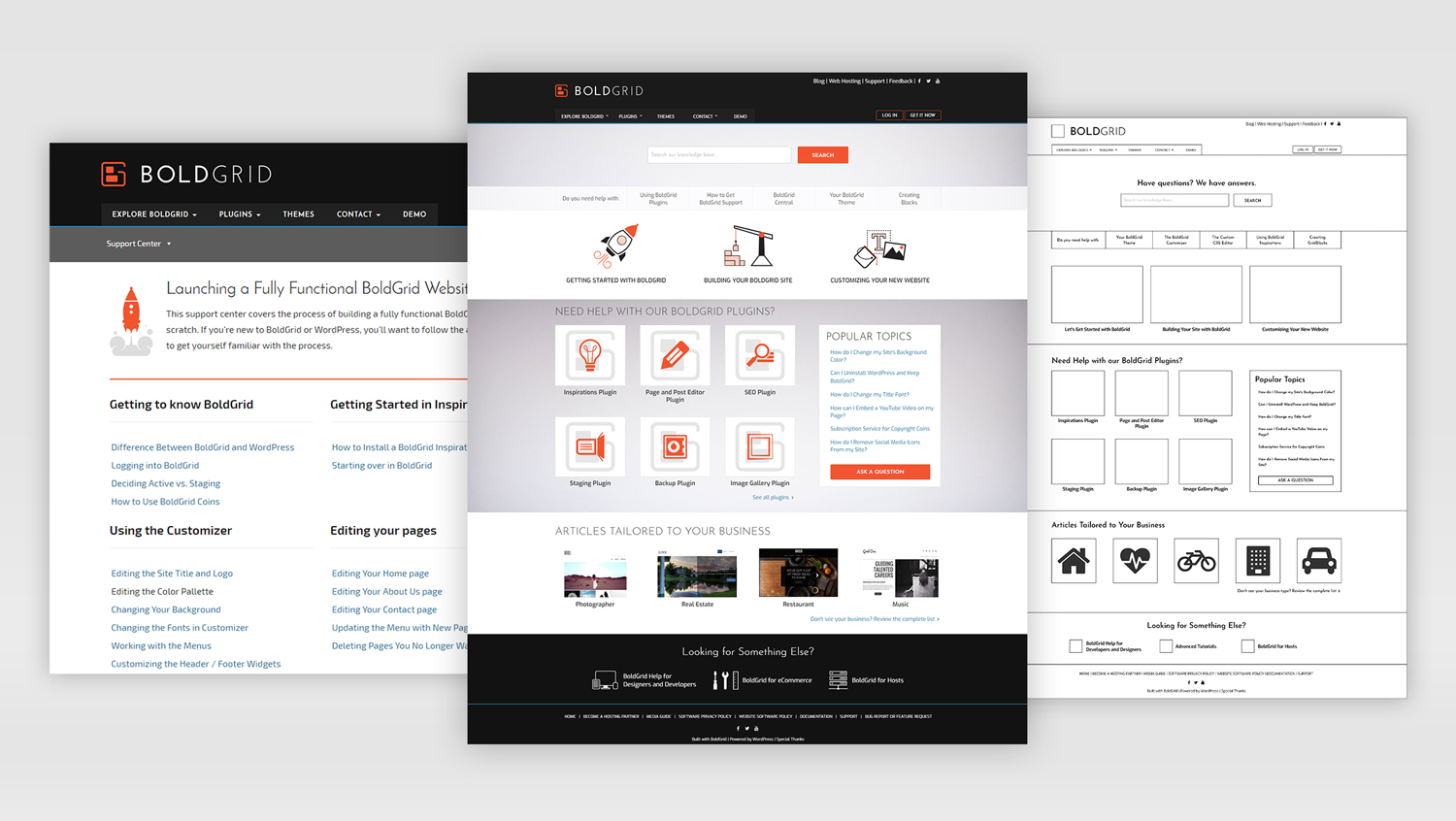
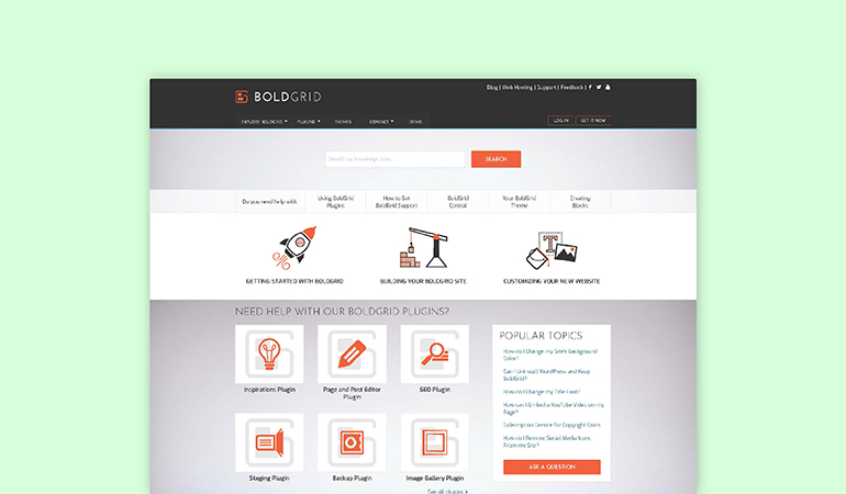
Original Home Page (left), My Redesign (center), Wireframe (right)

Custom Designed Icons
About
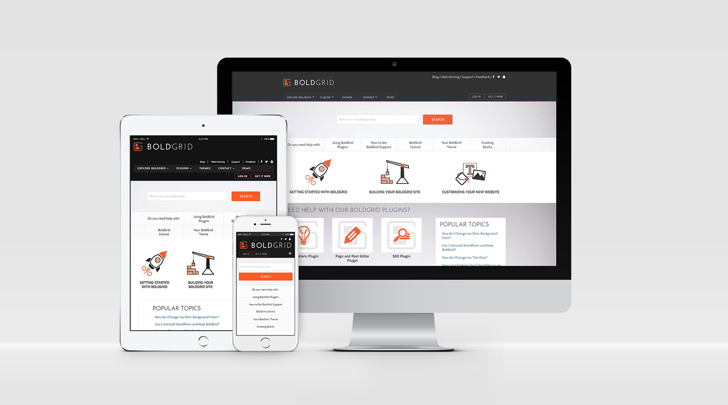
The BoldGrid Support Center needed a new design to enhance the User Experience. The original home page was an overwhelming laundry list of links causing cognitive overload on users. The search bar was not emphasized even though data showed that it was typically the first thing people went to. Additionally, it had a separate navigation from the rest of the site, causing even further confusion.
Before starting my wireframe I did competitor research on other site's knowledge bases; such as WordPress, Wix and GoDaddy. From this research and data on how people were using the current site, I knew I wanted the search bar to be much more prominent on the home page. I also wanted more visuals included in the categorization of support topics. In addition, I removed the secondary navigation menu that was only for the Support Center.
BoldGrid is a website builder so most users on the support site fall into 3 categories; they have just signed up, they're adding their content, or they have started making the site their own. I used these 3 categories to structure the content and organize the site. BoldGrid also has stand alone plugins that each have their own support. These are quite popular so I included links to their corresponding support pages on the home page as well. Also included were the Q&A and specific business type support articles. The new UI has a much clearer call to action to either search for your specific needs or choose the category you fit into to find related help topics.
Role
UI/UX Designer


Allison Pastor Designs © 2025
Allison Pastor Designs © 2025
Allison Pastor Designs © 2025