Overview
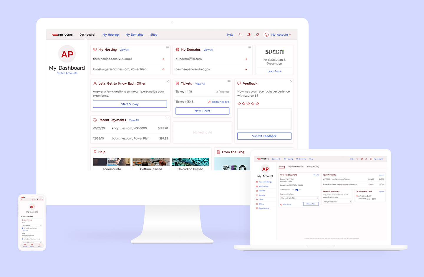
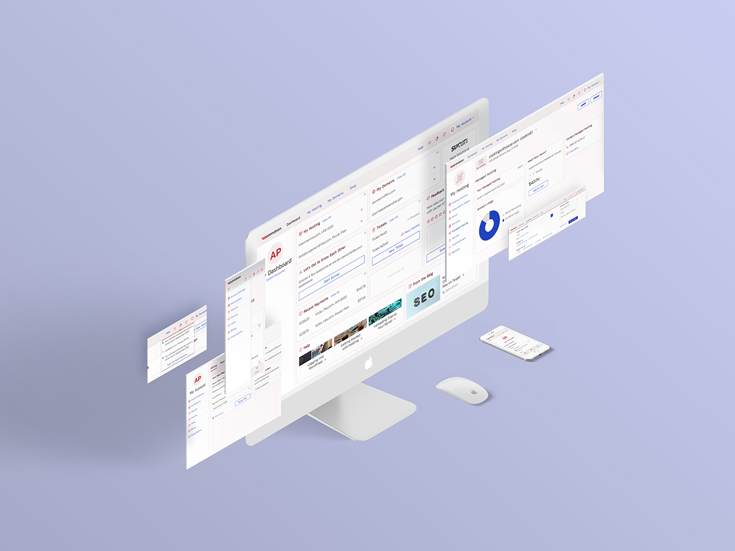
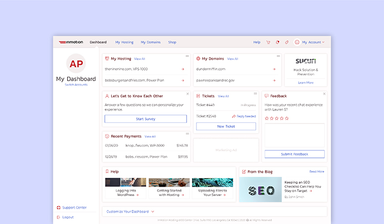
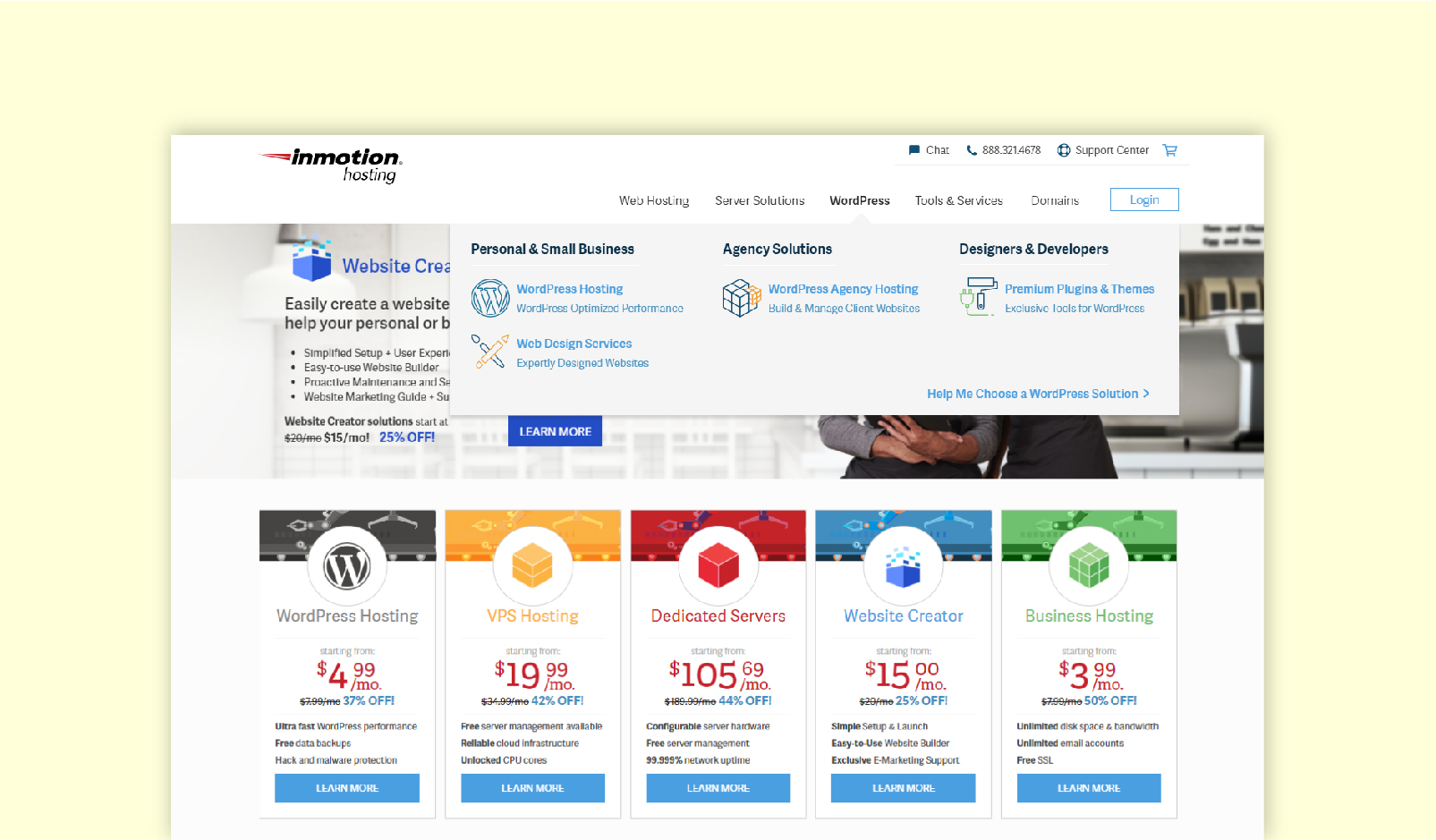
The Account Management Panel is used by InMotion Hosting customers to access and control their hosting subscriptions, as well as other products purchased from the company. These other products include domains, design services, and various hosting enhancements. The ability to manage their subscriptions with InMotion easily is a huge incentive for purchasing products and remaining at the company.
My Role
Lead UI/UX Designer
Responsible for:
- Information Architecture
- 100+ Unique Wireframes
- Visual Design
The Team
UX Researcher
Development Team
Tools Used
UXPin Prototyping Software
Adobe Illustrator
Adobe Photoshop
Restructuring for Greater Flexibility
As the company began to grow and offer more products and services, our existing account interface tried to expand to meet these growing needs. However, we soon realized we needed a more flexible and versatile solution. I proposed an account portal restructuring so that InMotion could continue to meet, and even exceed, our customers' needs & expectations.
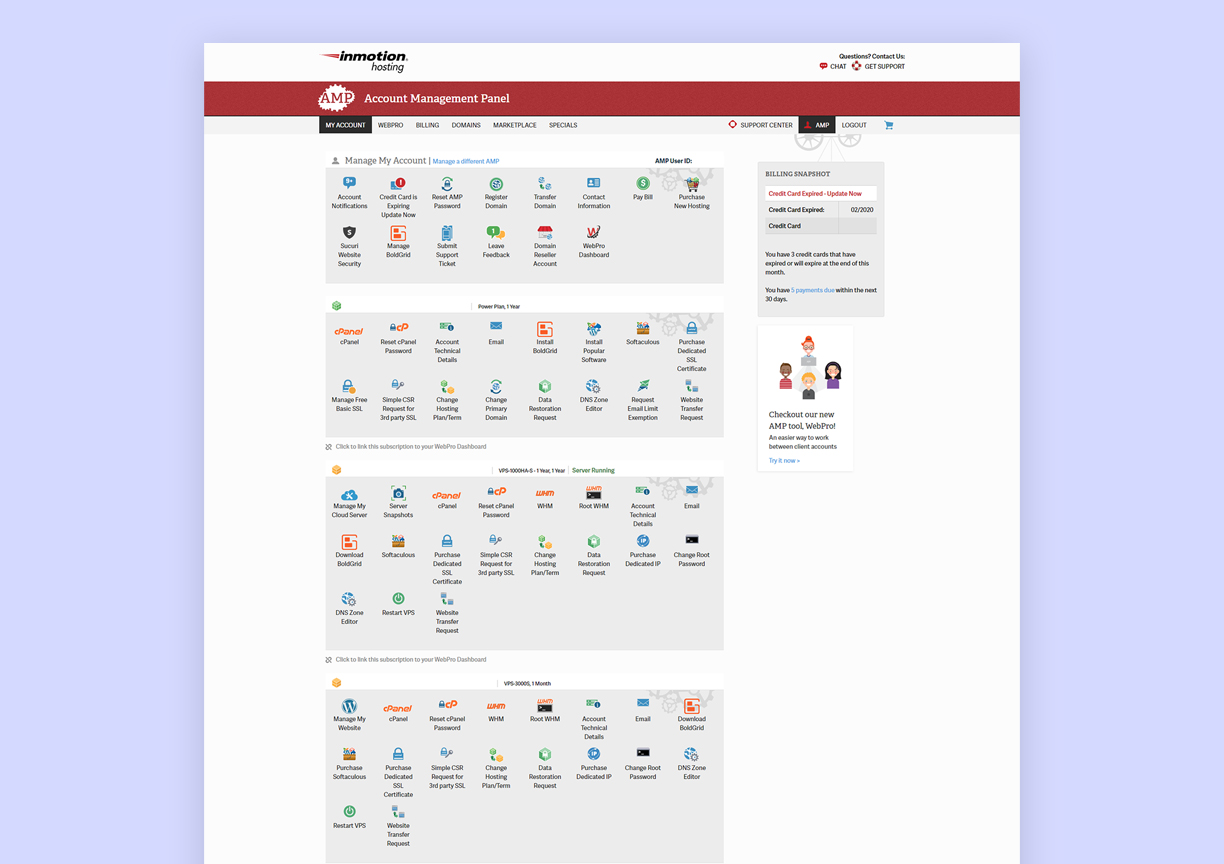
Existing InMotion Hosting Account Management Panel
Key Goals
- Restructure the Account Management Panel to be more task-oriented.
- Reduce cognitive load by modifying the existing information architecture. This was especially crucial for customers with multiple hosting subscriptions.
- Create a more personalized experience that adjusts with the customer's needs.
Customization for our Wide Range of Users
Our current account portal was a one-size-fits-all approach. Every customer, regardless of product or needs, was presented with nearly the same interface. As our product offerings diversified, this solution was no longer working. We have users who have single one-page websites who have substantially different needs from users with large dedicated servers, or users with cloud-based plans. Some customers use our company's design services, while others purchase advanced technical support. We also have customers who resell hosting, and others who purchase 100s of domains with InMotion. This varying customer base demanded an account portal that can accommodate high levels of customization, both by the user and by the company.
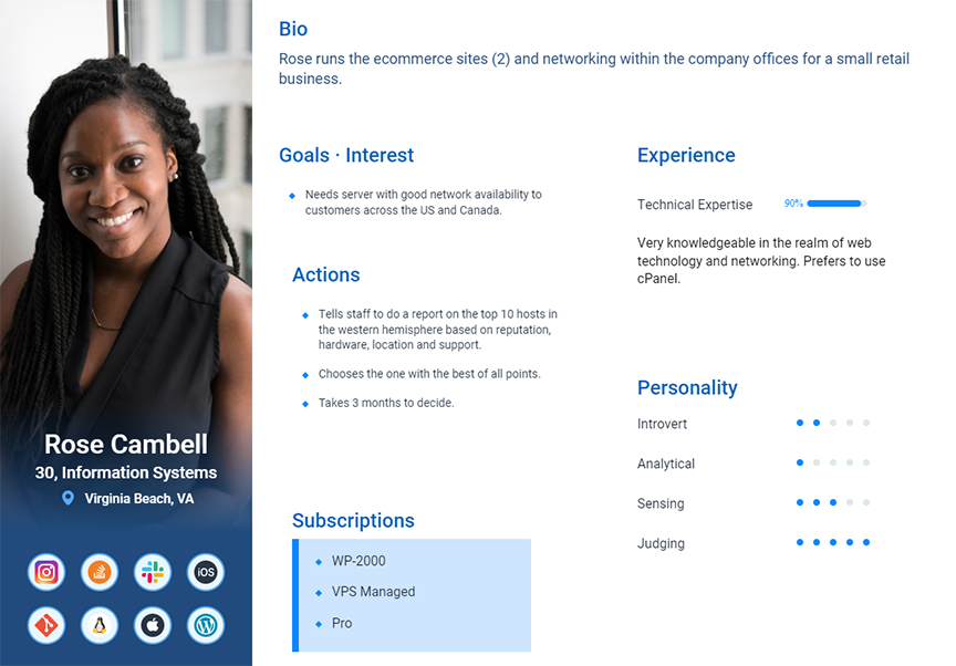
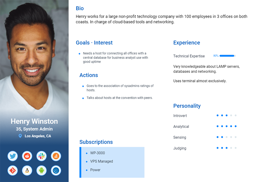
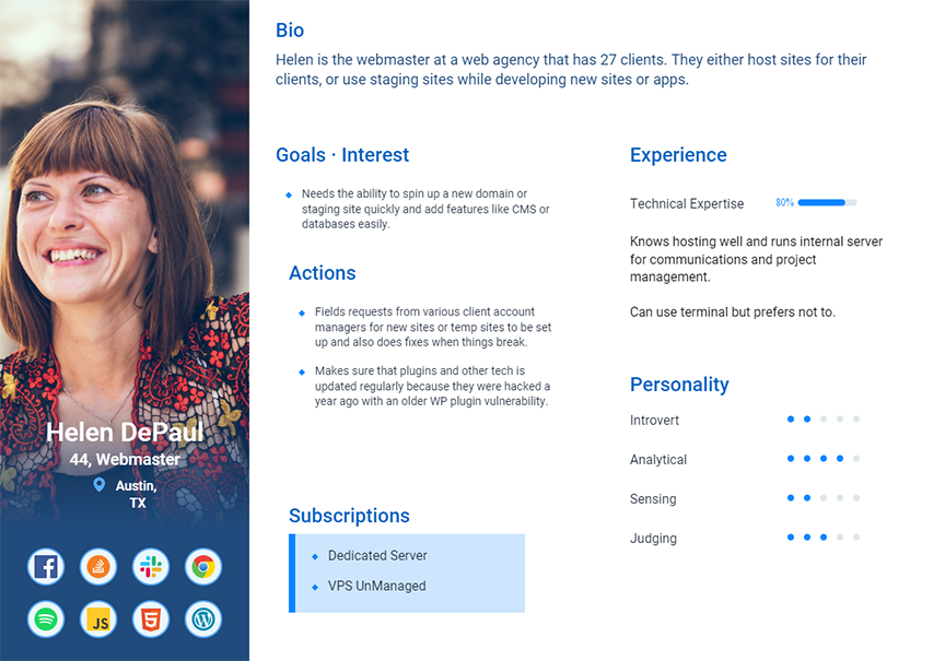
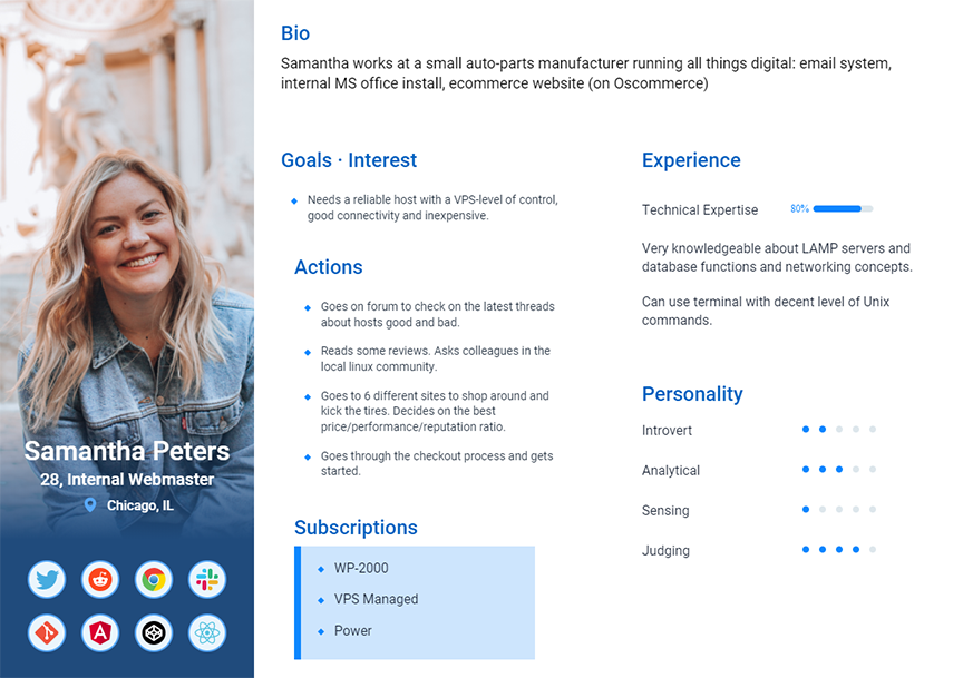
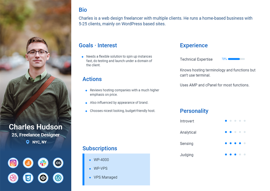
Personas created by our team's User Researcher
Project Constraints
The largest constraint on this project was my availability. For nearly the first year of this project, I was the sole designer at the company. Therefore, I had limited time to devote entirely to the account restructure. We also started a project to redesign InMotion Hosting's overall brand styles, which I was the lead designer on. After we hired a junior designer, I was able to devote more time to the account project. Another unique constraint was that the visual styling could not be applied until the new styles from the redesign project were approved and finalized.
The Process
Design Audit | User Feedback on Current Site | Wireframes | Moodboards | Prototypes | User Testing
Establishing a New Information Architecture
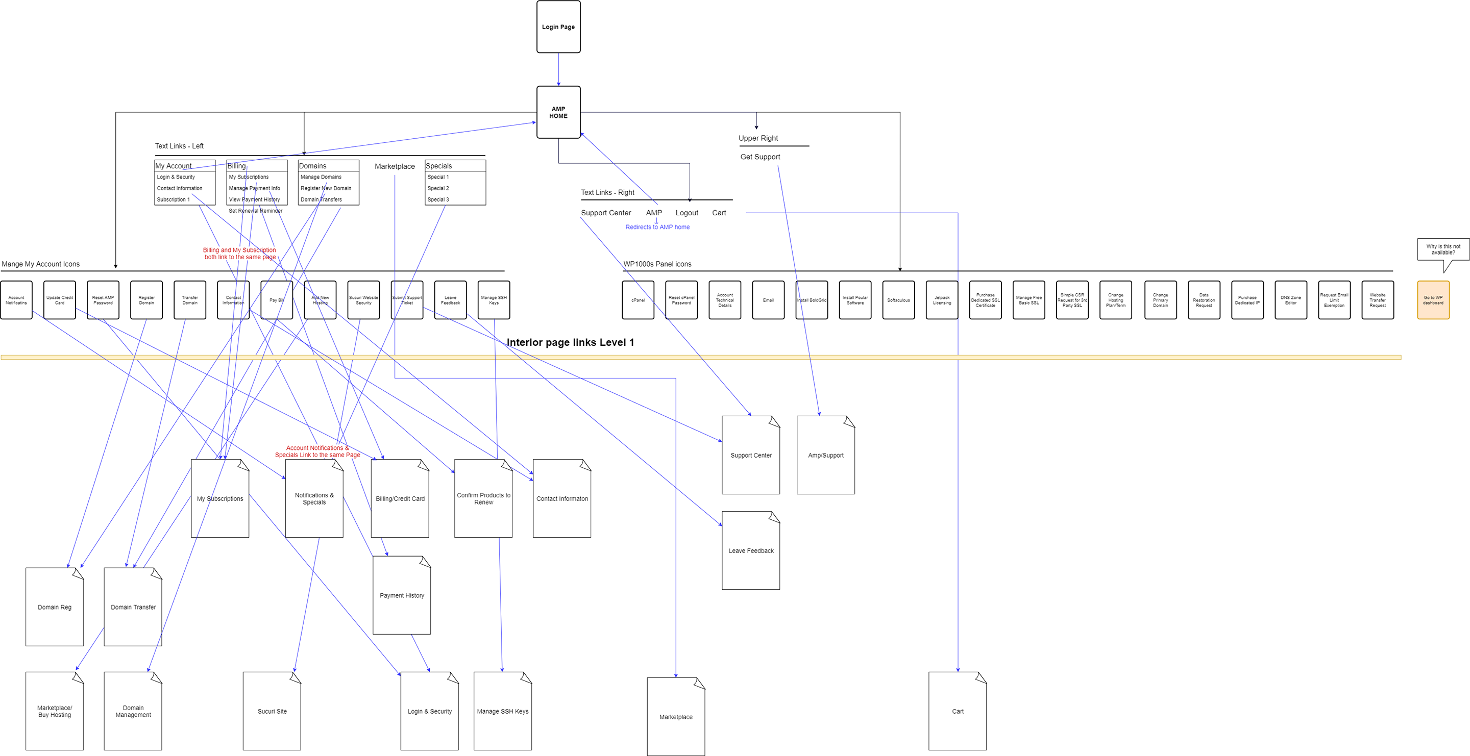
The existing IA for our Account Interface was, quite frankly, a mess. Our entire myriad of tools was accessible from a single page. This created a hugely overwhelming experience for our users. If a customer had multiple hosting subscriptions, it was even worse, as every tool for every subscription was showing right away. We often received feedback from users of confusion, being unable to discover things, and being unsure of where to start.
Information Architecture of the existing Account Management Panel
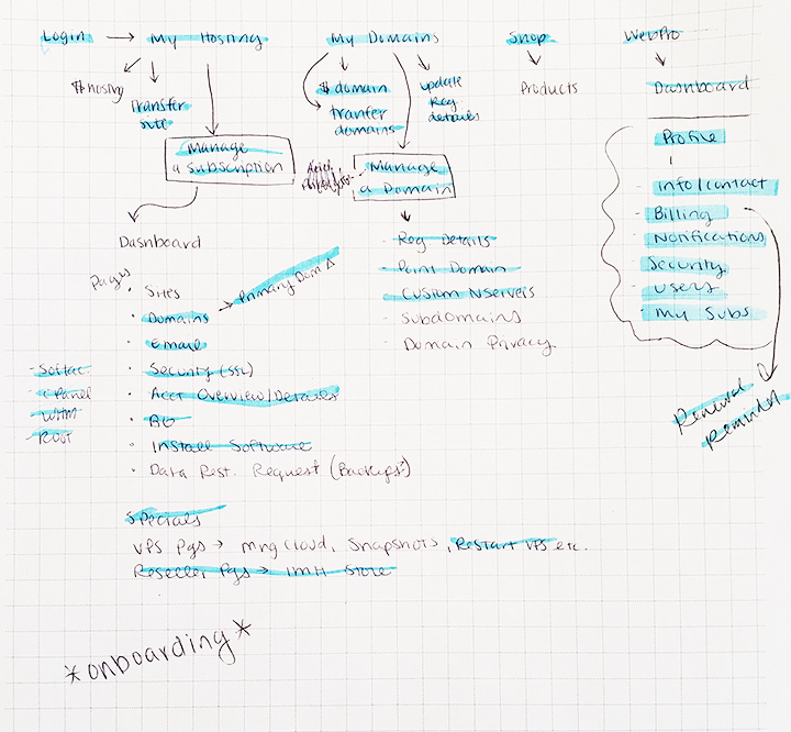
IA Brainstorm
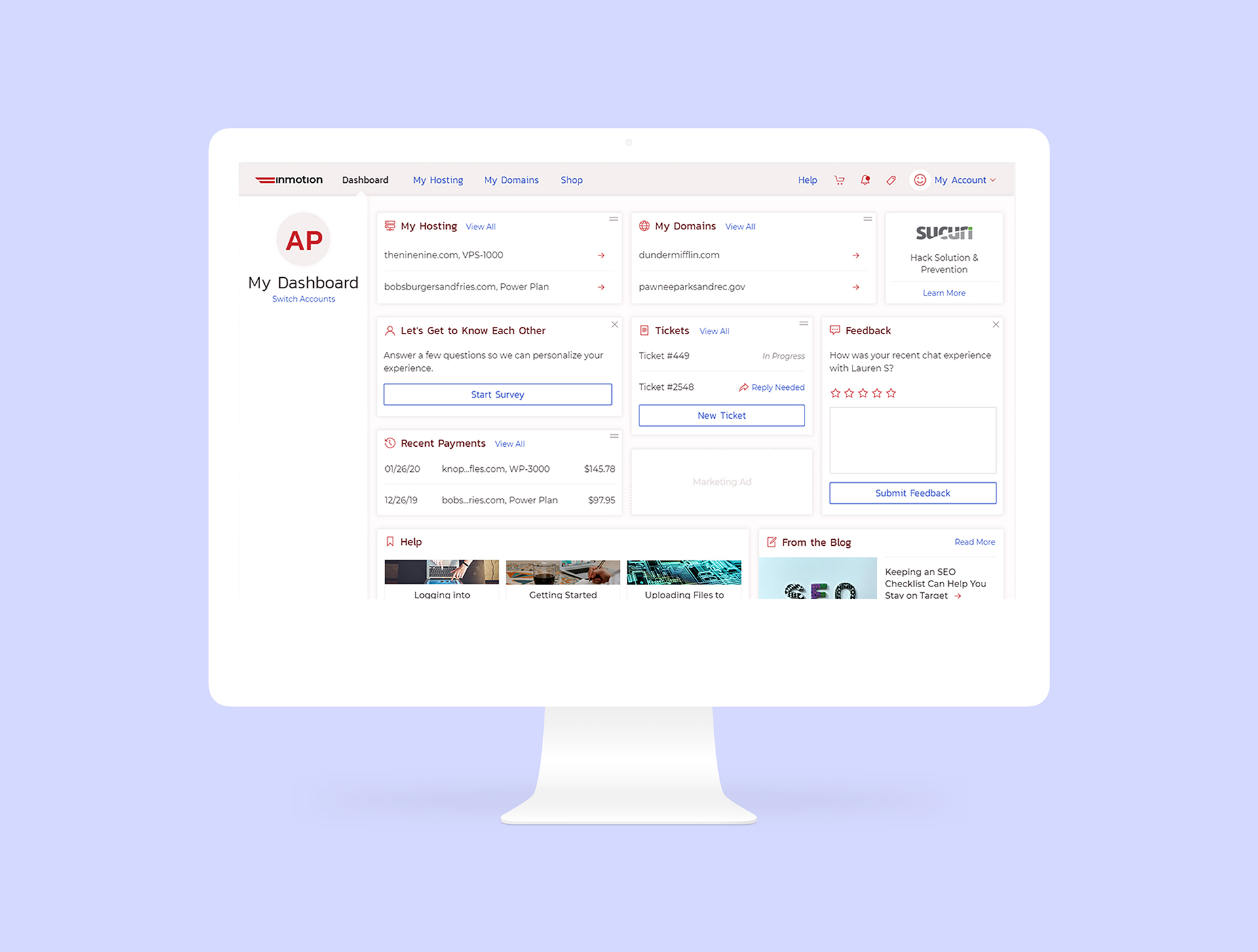
When rethinking the Information Architecture for the redesign & restructure, I knew I wanted things to be more broken down and logically categorized. Through past feedback, as well as data from card sorting I worked through a new IA. The new structure started the user at a dashboard page which had overview information and any important notices or alerts. The user could then navigate to a page with all of their hosting subscriptions displayed, or to a page with their domains displayed. From these respective pages, they could navigate into a specific product and perform whichever tasks they needed to.
This new structure is much more task oriented. Users login to their account to accomplish a specific goal. This is typically for a single subscription, or for an account related task (i.e. adding a payment method). With the new IA, the user can quickly get to the subscription they want to manage, and see the specific tools and information for that product. This also made our account software more flexible. As we diversify and expand our product offerings, we can further customize the specific product account features.
Final Restructured Information Architecture
Ideating & Sketching Potential Solutions
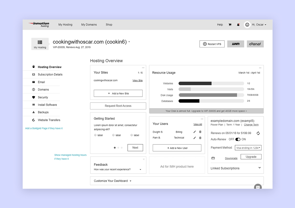
Once the new structure was finalized, I began to sketch and work through various pages. My typical process involves paper sketches as I believe it allows me to get more ideas out there quickly, without prematurely moving forward with the first thing that comes to mind.
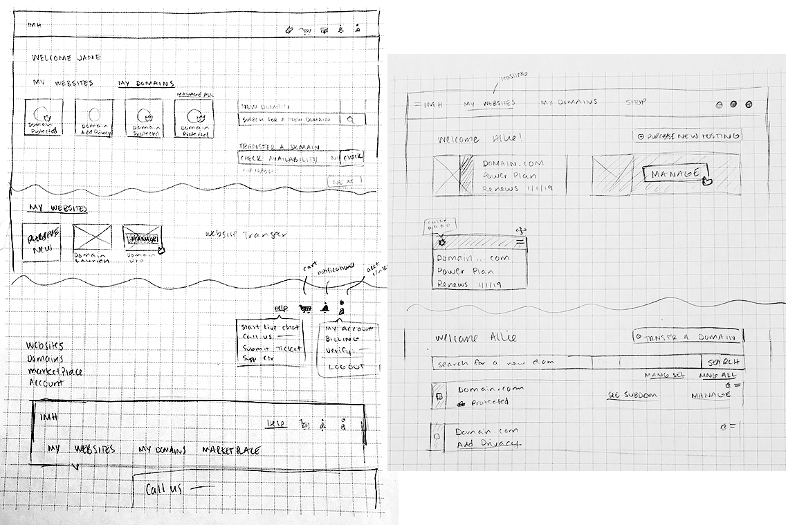
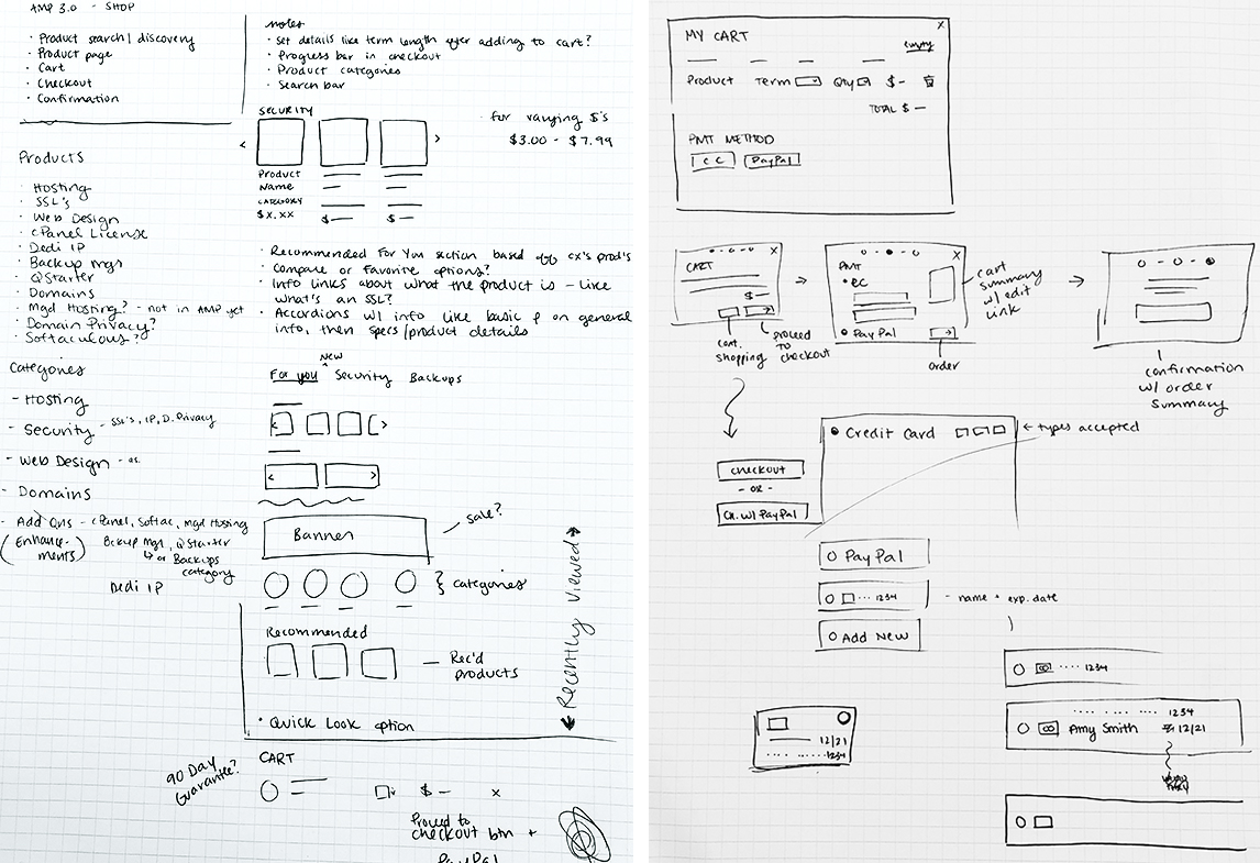
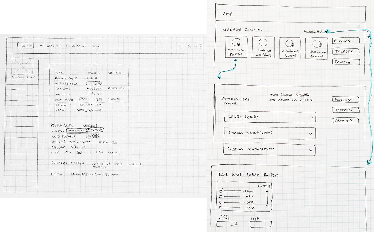
Initial Concepts, Sketched Wireframes
Rethinking Every Process & Tool
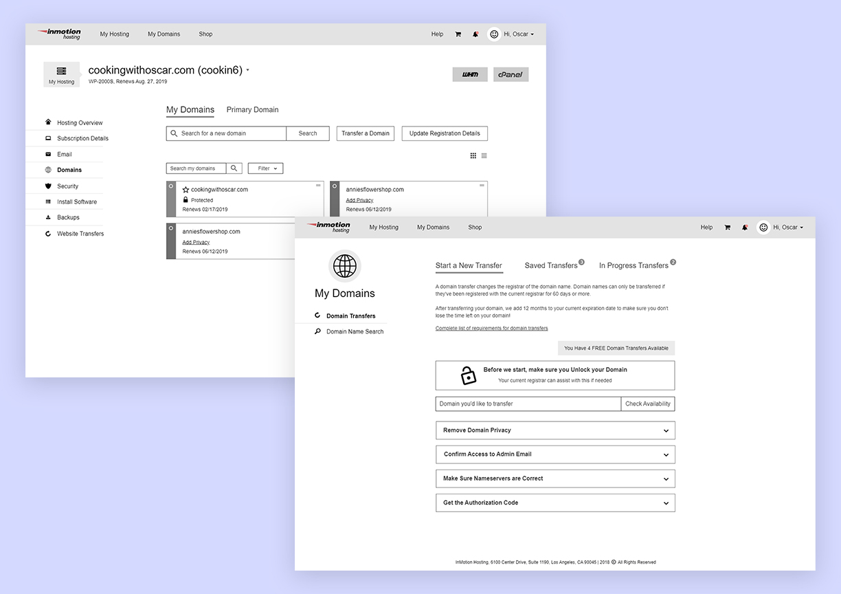
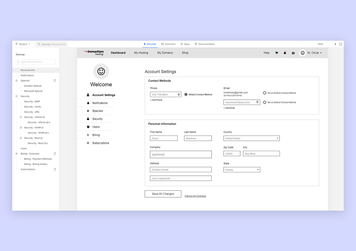
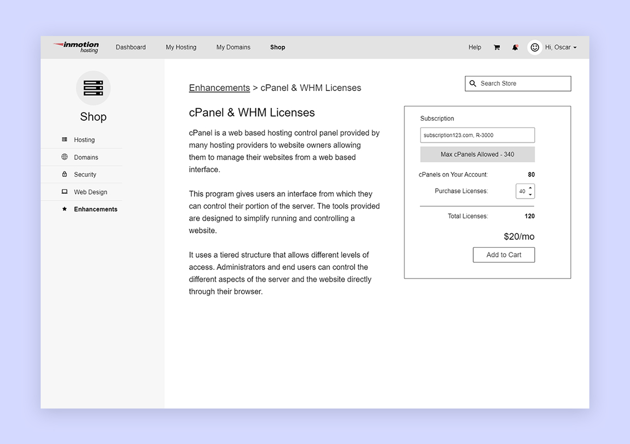
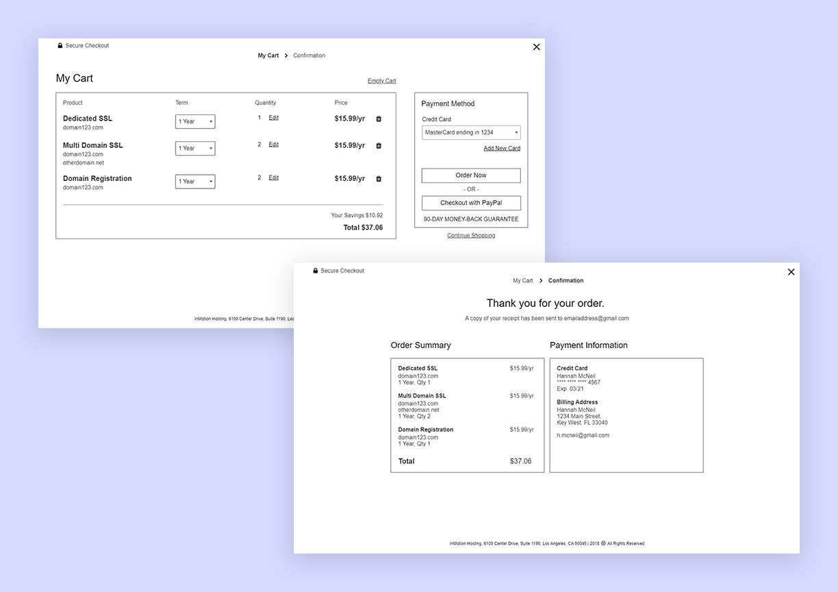
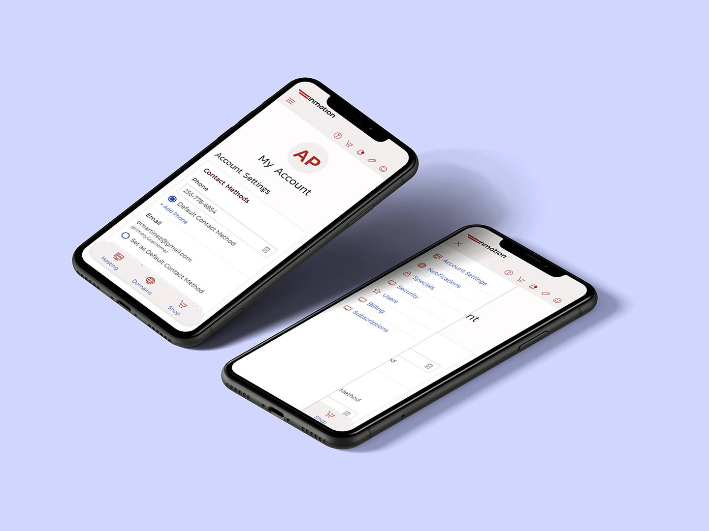
Our account software has a vast number of tools for our customers. These tools vary depending on the products owned. Beyond simply restructuring the IA of our account software, I also wanted to add features and revamp many of our existing tools that were lacking in usability. The final page count for wireframes was over 130. I also included dashboards in my new design and created various interchangeable blocks for the page depending on the users situation and products.
Final Design
During user testing we received the following results:
- Much higher success rate for our users accomplishing their tasks than achieved while using our current account software interface.
- Users with more than 2 hosting subscriptions were able to more easily accomplish their goals. Were more aware of the tools they could use in their account and could more easily find what they were looking for.
- Beginner users were pleased with the more personalized approach and the targeted help in getting them started. Veteran users enjoyed the quick glance dashboard to see if there was something that needed their attention.
Unfortunately, I do not have further KPI's as this new account software is currently in development.
