Redesign & Rebrand of InMotion Hosting
UI/UX Design | 2019-2020
Overview
InMotion Hosting is a web hosting service that provides a variety of hosting products, from Shared to VPS, WordPress to Dedicated Servers, and more. The business was started in 2001, and the website and brand design had not been updated since 2013. Furthermore, the company is planning on adding higher-end products in the near future. For these reasons, our team realized our brand and company needed a refresh that both modernized our look, and appealed to more enterprise & high-tech customers.
The initial scope of this project was to redesign the highest-trafficked pages, as well as any pages linked from the home page and the main navigation. We also included a rework of our promotions, new email templates, and social media profiles.
My Role
Lead UI/UX Designer
The Team
Junior UI/UX Designer
UX Researcher
Content, Marketing, & Dev Teams
Tools Used
UXPin Prototyping Software
Adobe Illustrator
Adobe Photoshop
Revitalizing a Brand to Align with Future Goals
The current brand styles for InMotion Hosting were outdated. They were also designed when the majority of our customers were smaller businesses, bloggers, or freelancers. Therefore, they appealed much more to that type of persona. This did not fit our future needs of marketing to potential customers interested in powerful, high-end hosting solutions.
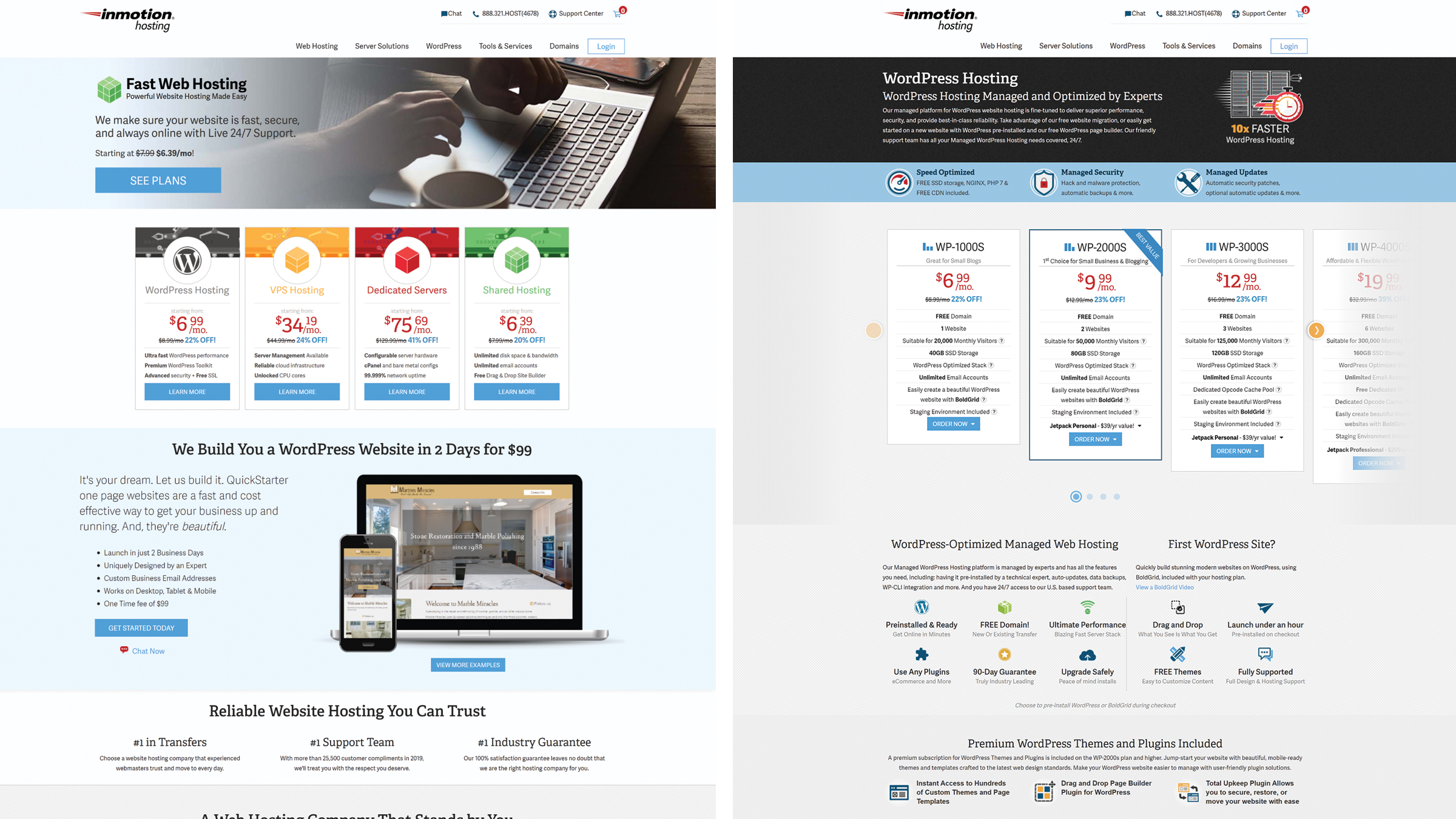
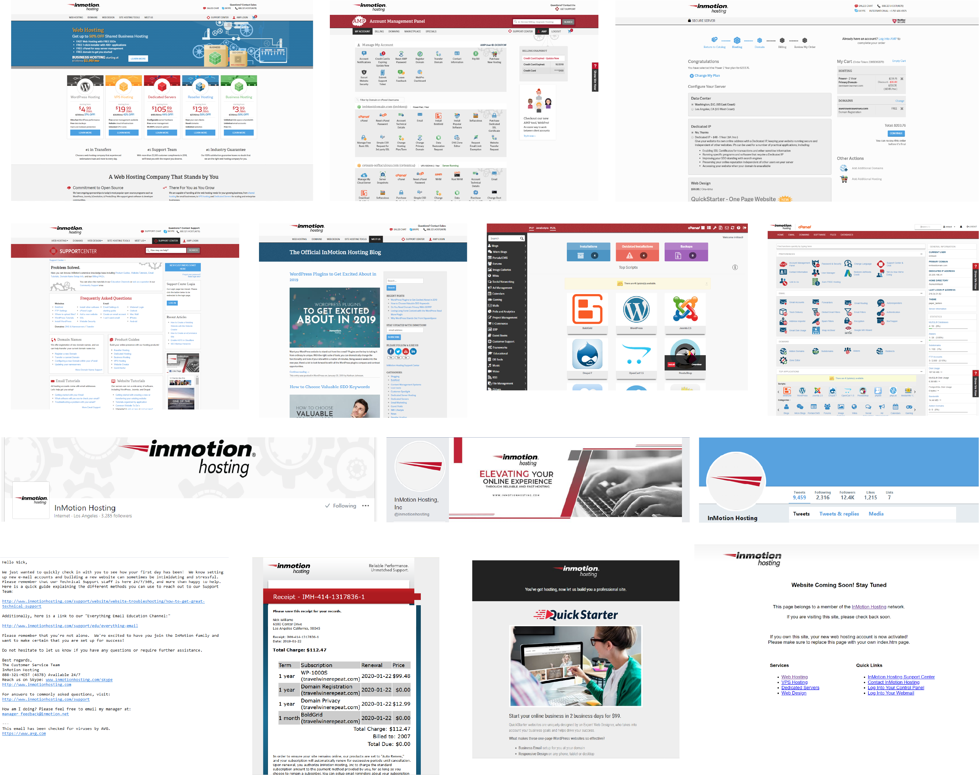
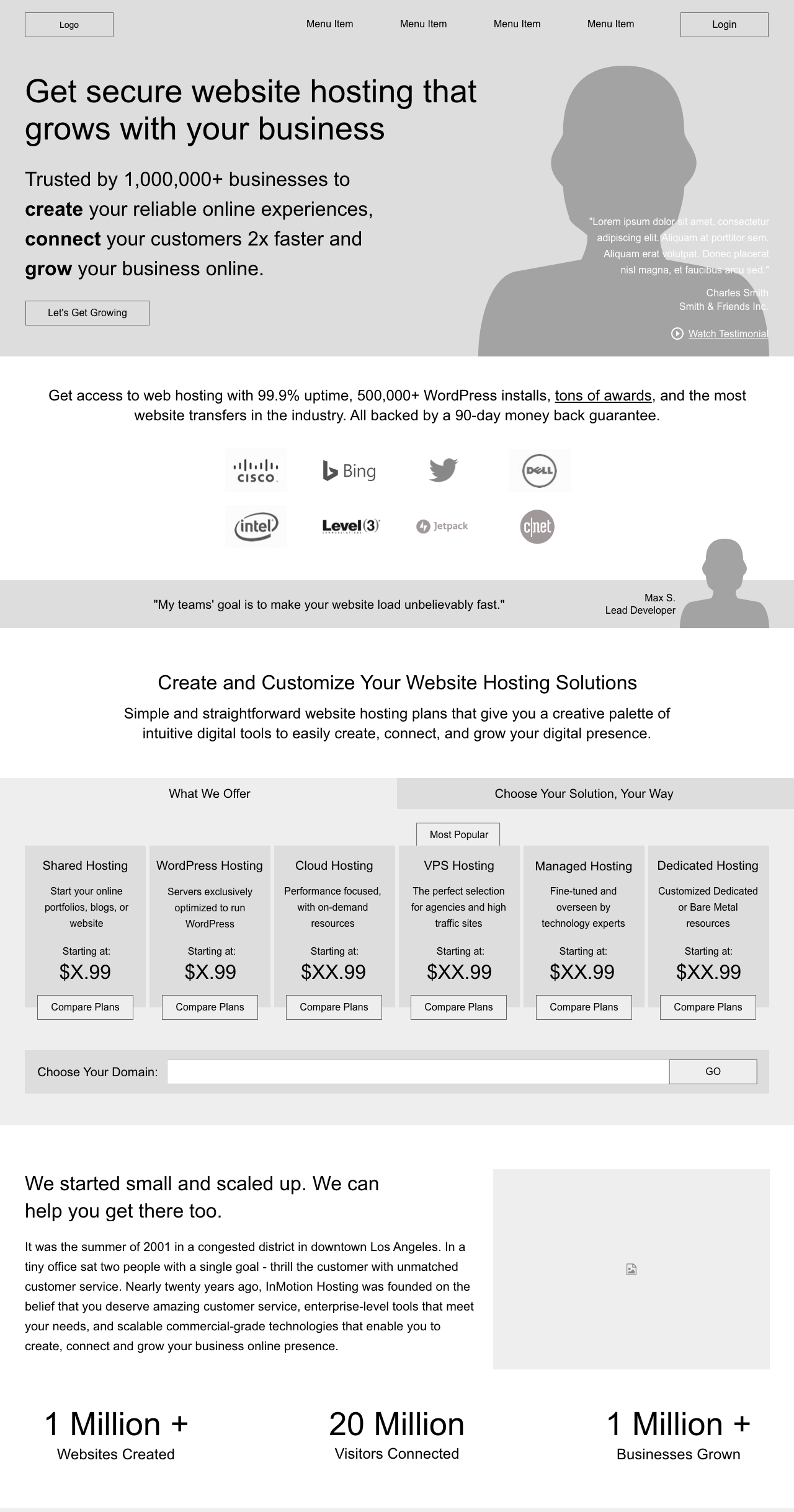
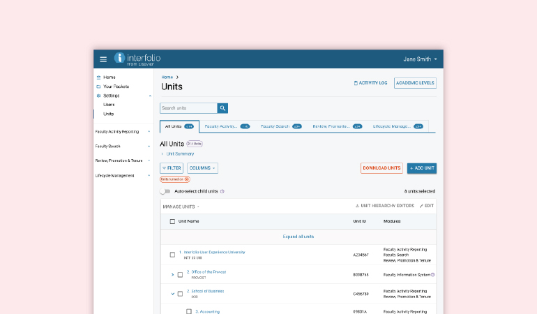
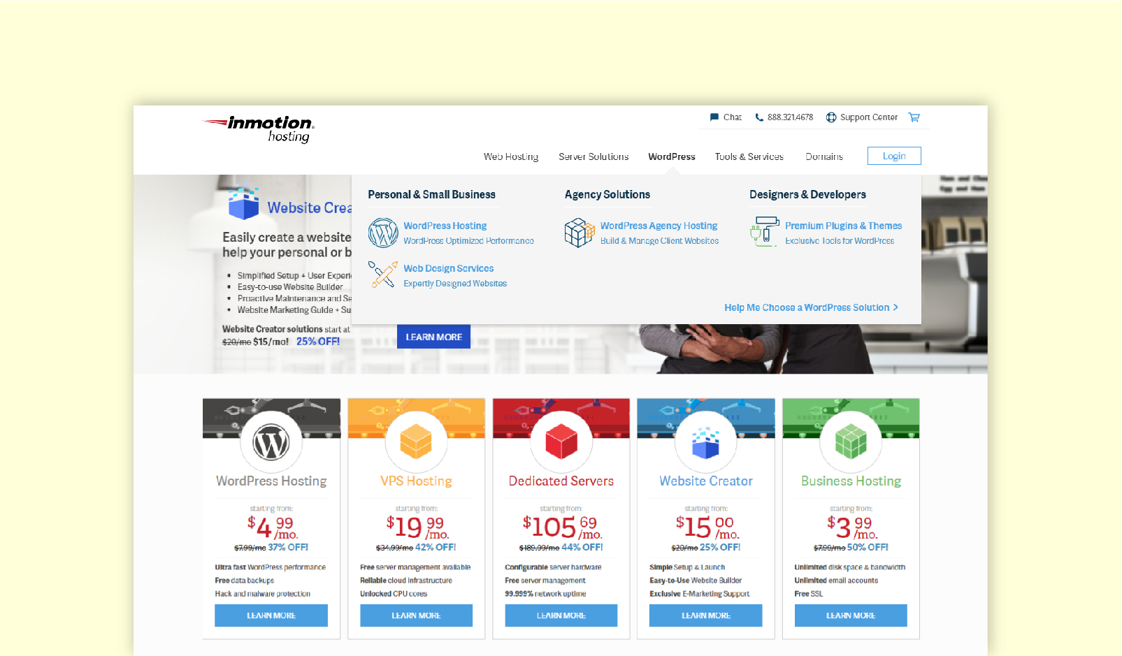
Existing InMotion Hosting Website
Key Goals
- Create a modern and consistent style across all visual elements.
- Emphasize our superior customer service and support.
- Attract a more technologically proficient customer, but do not intimidate users interested in our less robust products.
Our Users & Audience
Our new style, from visuals to content, needed to work well for potential customers interested in hosting for a smaller need, like a blog or small business website, while also appealing to those interested in large, technical server solutions. This wide array of customer personas was one UX problem our team needed to approach and overcome. The User Researcher developed the following personas for our use throughout the project.
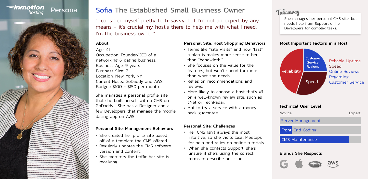
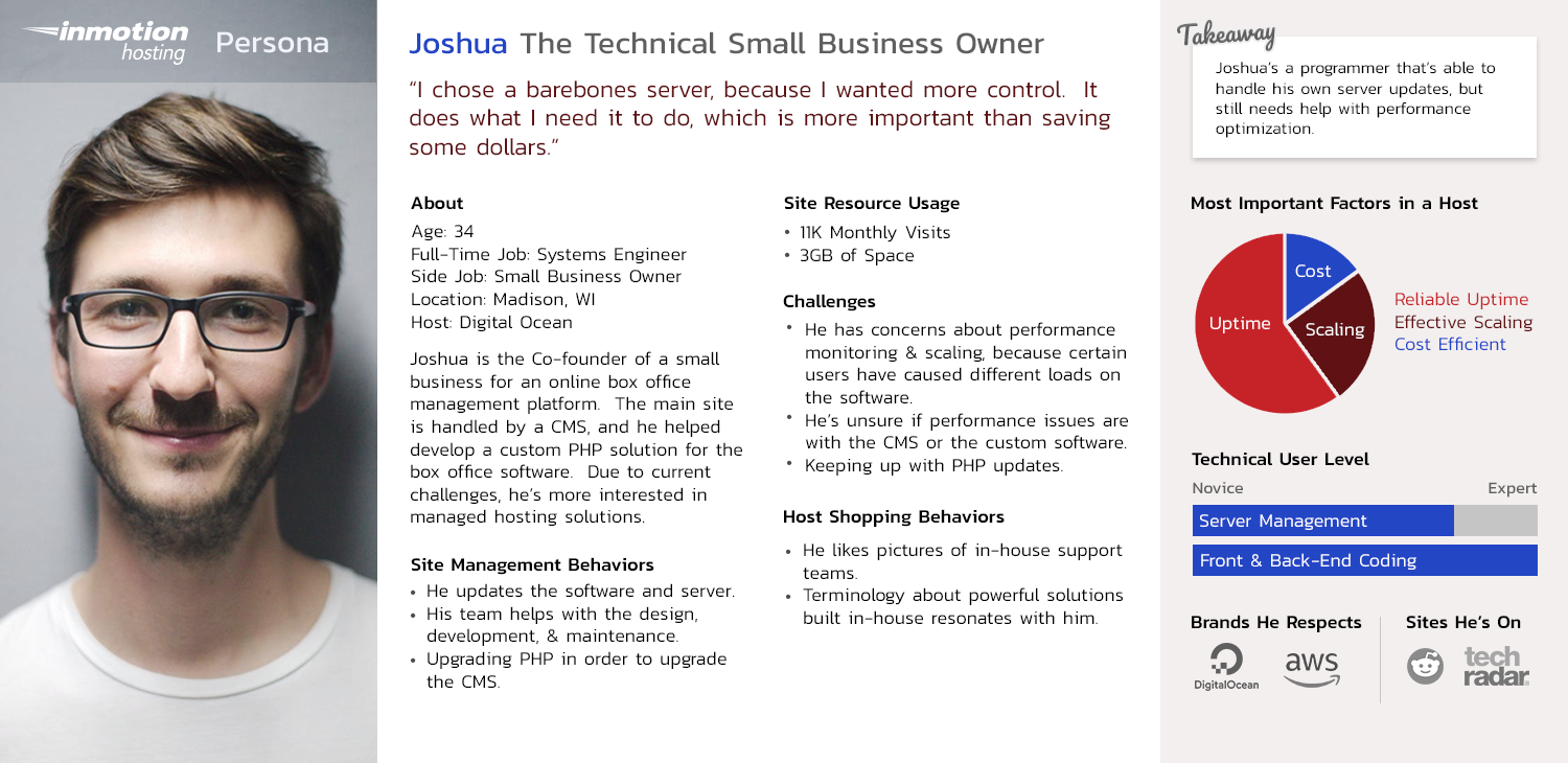
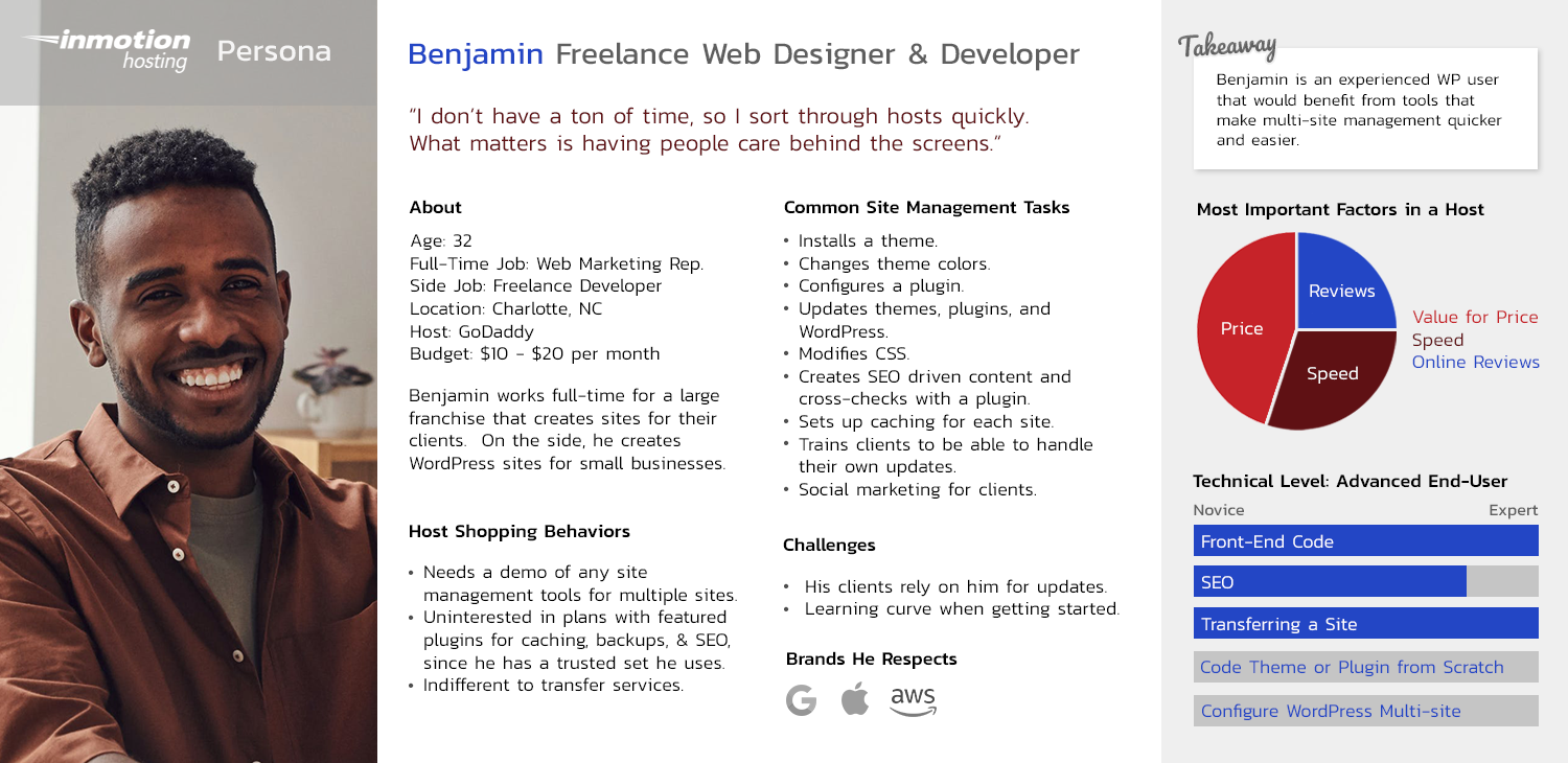
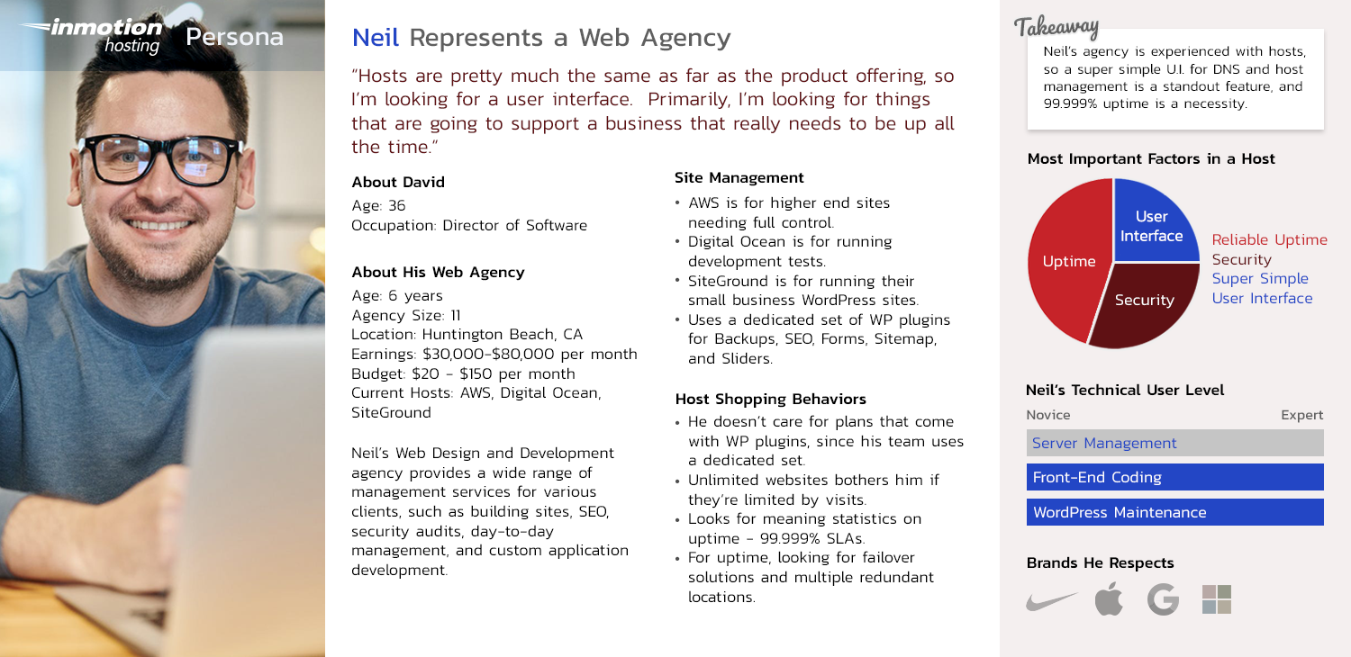
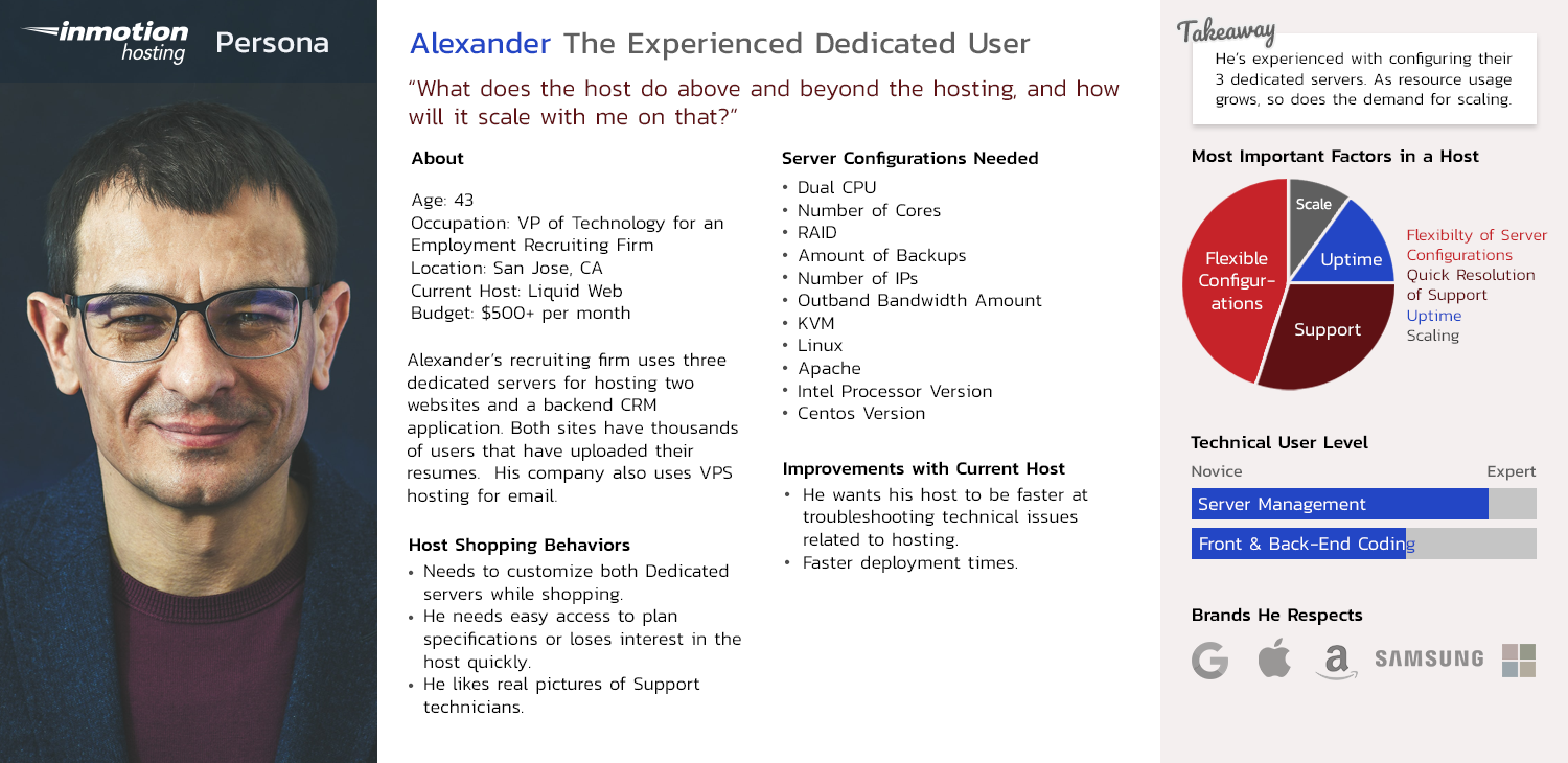
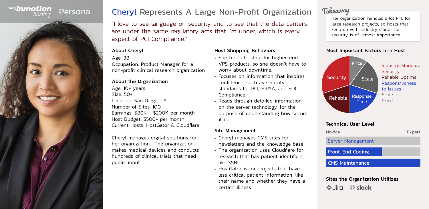
Personas created by our team's User Researcher
The Process
Design Audit | User Feedback on Current Site | Wireframes | Moodboards | Prototypes | User Testing
Design Audit
- Define all of our visual assets.
- Document our current inconsistencies.
- Complete competitor reviews.
- Propose a course of action.
- Present for stakeholder approval of the project.
The first step to the redesign process was performing a design audit. I reviewed all of our brand's visual assets; from emails, icons, and our website, to our social media presence. I noted how inconsistent our overall brand was across various platforms, as well as within our website.
From 4 different styles of a rocketship icon to a rainbow of colors, our brand style was unclear & hard to identify.
Furthermore, many of our styles were out of date. Modernizing the site would help increase our relevancy in the eyes of our customers and build their trust in us as a respectable and experienced company. With being a hosting company where technology is the focus, I thought it especially important to create a fresh and modern brand style.
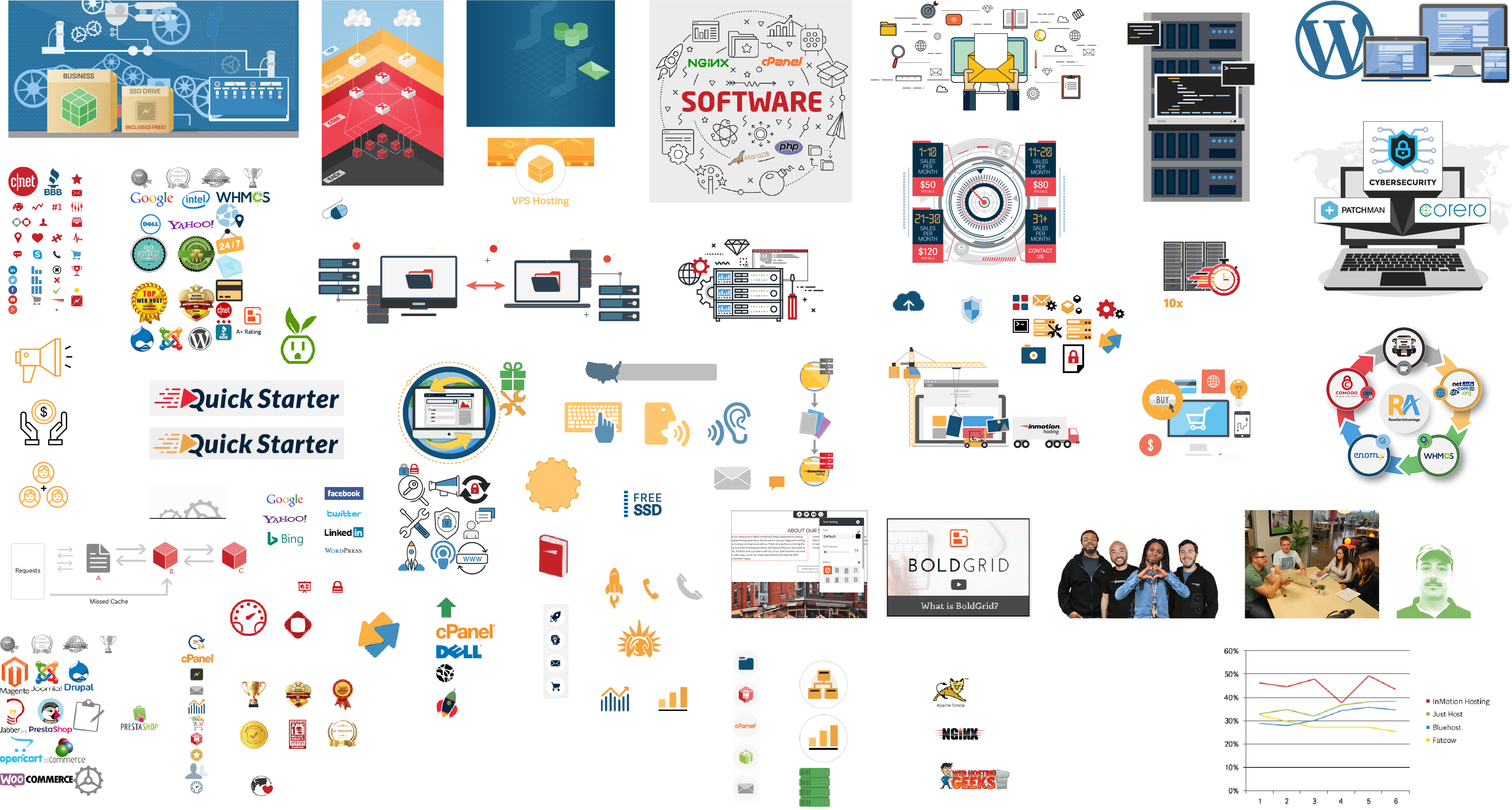

Examples of our inconsistent brand prior to the redesign
During the audit, I also completed competitor reviews. I used these to show how outdated our styles were as well as how unfocused our brand appeared in comparison.
The end result of the Design Audit was a detailed written report, a presentation our team shared with stakeholders, and a proposed course of action; from which we received approval to move forward with the redesign project.
User Feedback on Current Site
Our team's User Researcher and I collaborated on user studies. During these studies, we had users pretend to shop on our site and various competitor sites and then provide feedback. The quotes we received went a long way in convincing the company stakeholders that a redesign was not only necessary but would provide real monetary benefits.
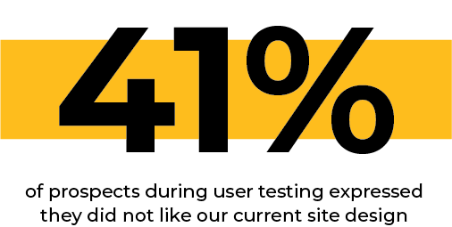
Quotes from User Studies:
“This interface, wow! It’s like getting punched in the face with content ... it’s not pleasant for me at all … I really like the look of [competitor], so I would choose them over InMotion any day.”
"Pretty standard and boring, not that attractive"
“The first thing I notice is the design - I don’t really like it”
Wireframes
During wireframing, I focused on several areas of improvement. Our current site was very static and didn't make good use of interactive elements to reduce the initial cognitive load. By making the site more interactive, I was able to hide context only specific users were interested in.
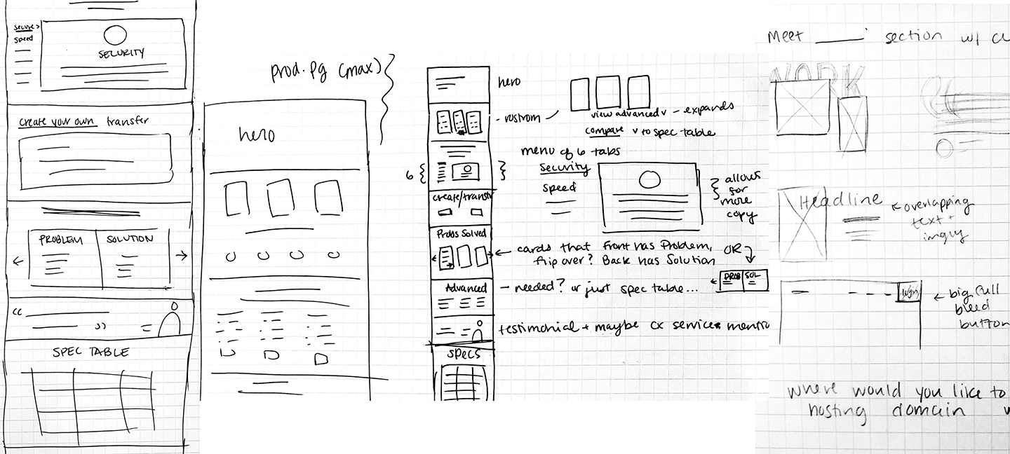
I also consolidated some of the journeys. One way I did this right from the home page, was by adding a domain search bar. This allowed users to get started with the one thing they were sure of; their domain.
Another goal for the home page was to focus on the company as a whole. Our existing home page targeted a few specific products, instantly alienating users who were uninterested in these offerings. To accomplish this goal, we added more trust builders using social proof. We also highlighted company-wide selling points, like our 24/7 customer service.
Lastly, we provided an alternate journey for users who were unsure of a specific product by adding solution-specific paths. This helps users who want to narrow down products suitable to their needs, and users who are unsure of which product to select.
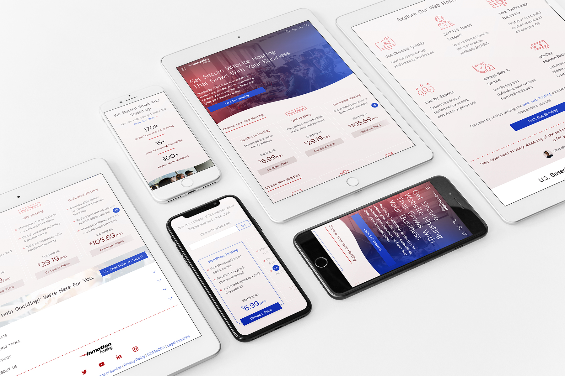
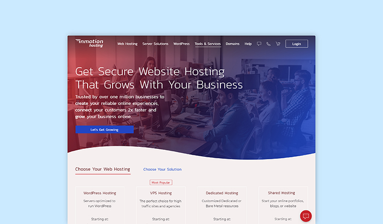
High Fidelity home page wireframe
Moodboards
Communicate the following:
- Trustworthy
- Modern & Relevant
- Technology Experts
- Great Customer Service
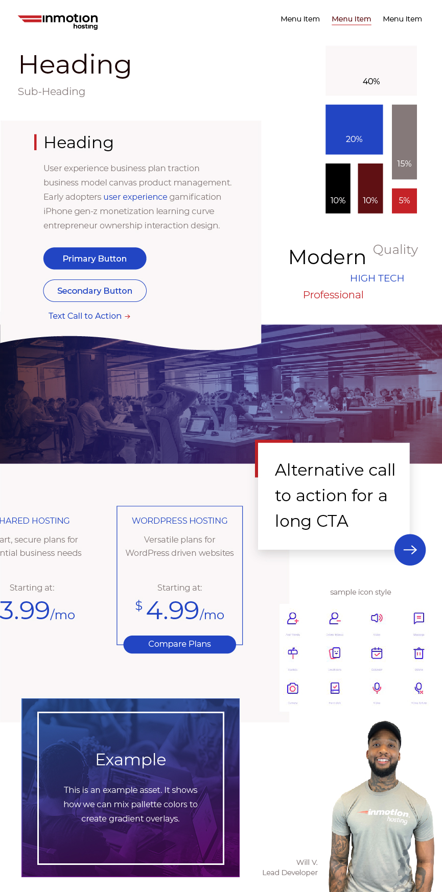
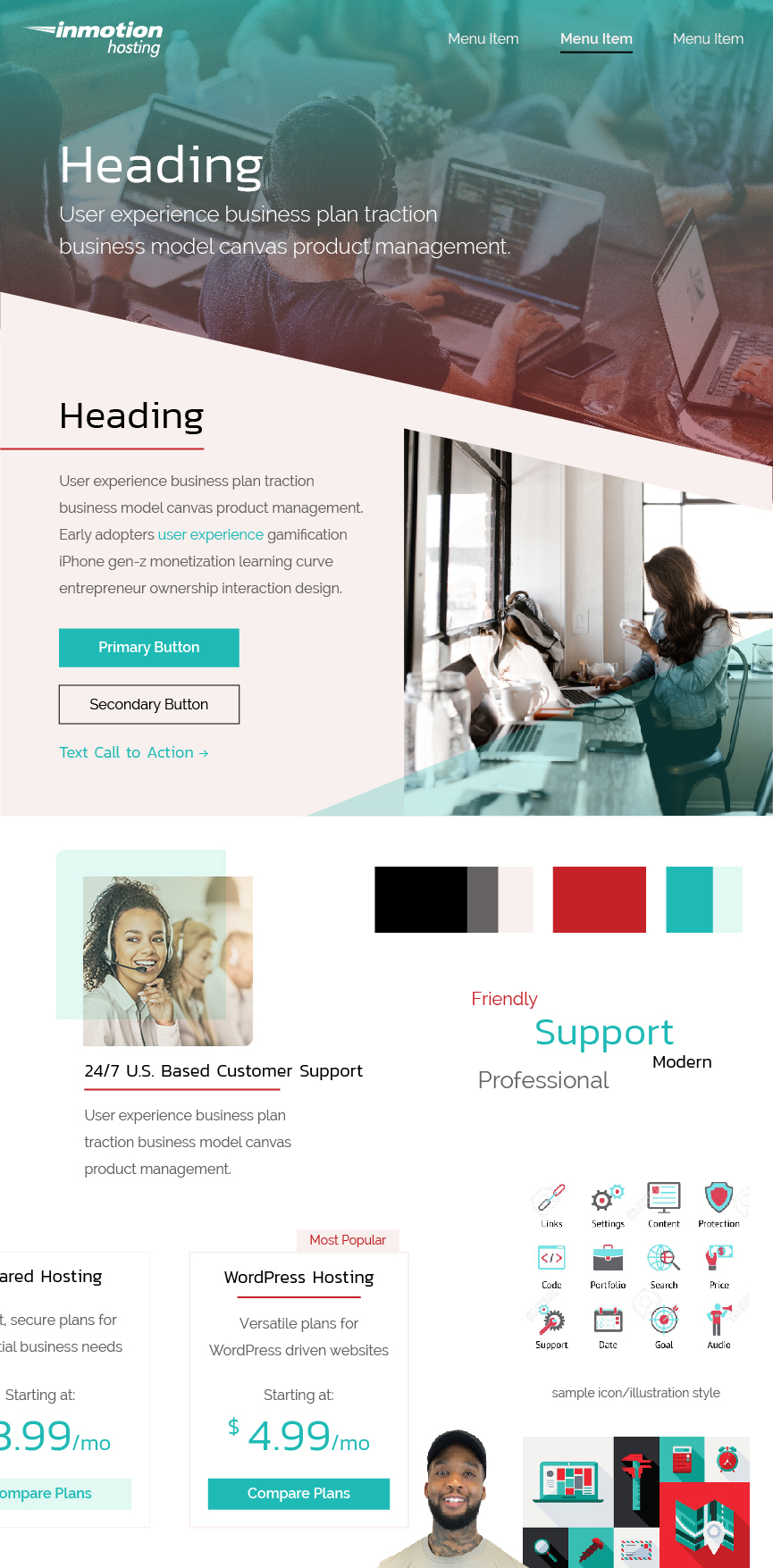
(Left) Chosen moodboard (Right) Alternate moodboard
Logo Refresh & Custom Icon Set
Logo refresh that will be released in a later phase.
A selection of icons from the custom icon suite I illustrated.
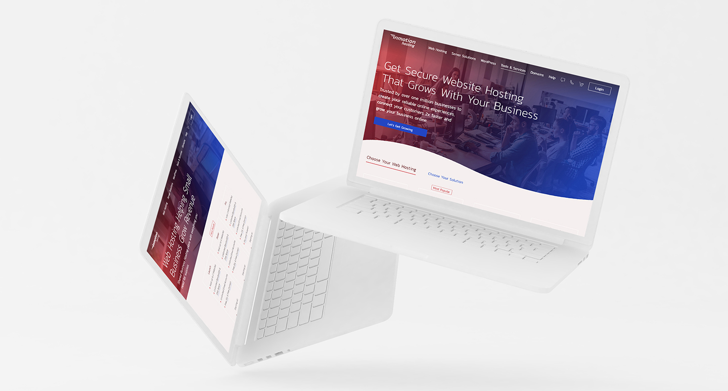
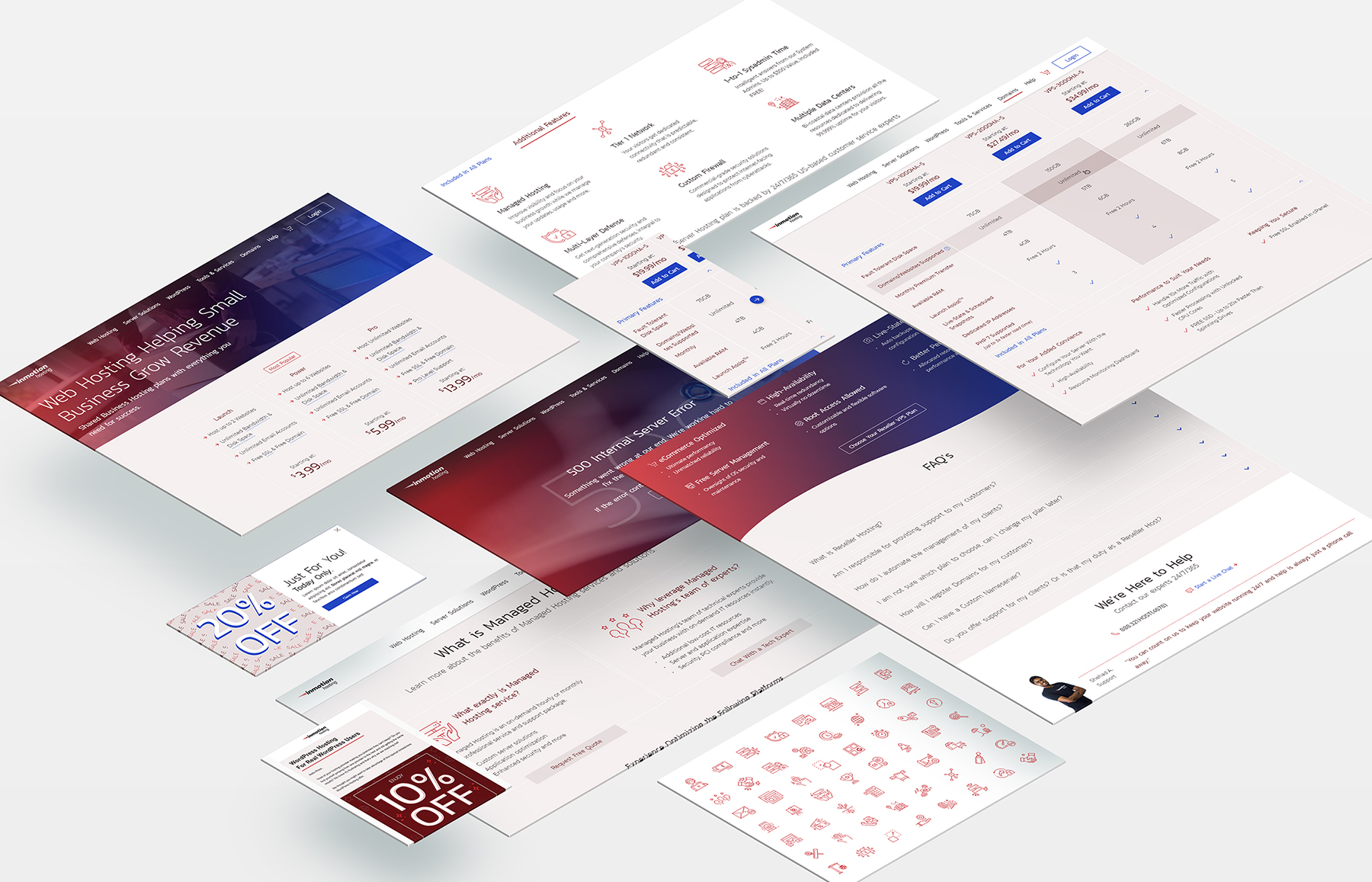
Final Design
User testing results from the new design:
- The brand appears trustworthy.
- The company has hosting options potential customers were interested in.
- It feels like this business would be technologically proficient.
- Their support and customer service team seem like they could help users be successful.
- The design appears modern & clean.
Key Performance Indicators
During initial A/B testing, the redesigned website had the following results:
- +25% Revenue
- +20% Overall Sales
- +22% Average Lifetime Revenue per Sale
Video of my interactive prototype.


Allison Pastor Designs © 2025
Allison Pastor Designs © 2025
Allison Pastor Designs © 2025